


March 04, 2004
Self-Critique: Wood Signs Icon Set
Note: Self-Critique will be posted every once in several months. The reason why I decided to do this is to encourage myself to step back and take a view at my work in different perspective. That way, I will be able to take a look at my mistakes and try to understand why they did not work. So, I can learn from them and try to improve my future designs. It is not only for me, but it is also an opportunity for you to learn from my mistakes and avoid making them in the future.
In each self-critique post, there will be a list of problems and solutions included with comparison screenshot (old against new). Even though this is a self-critique, you are more than welcome to post your own critiques and feedbacks.
Wood Signs Icon Set - Feb. 2002:
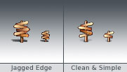
� Poorly done 32x32 and 16x16 icons
� Bad Shadows
 What did I do wrong:
I tried to make the icon as detailed as possible because I thought it would help icon to look more detailed in smaller size but it did not. It made the icon to be messy.
The bigger canvas I started on, the more tempting I want to add in more details. But when resizing them to small size, I forgot that there would also be less of space. So my filling in of details was overshadowing the design itself when it is scaled down to a smaller size.
What I should do:
K.I.S.S. (Keep It Simple and Sweet). Remove all unnecessary details and reduce the color palette to few dominant colors. Make sure texts have clean area around them for better readability.
In 800x800, which I usually start with my icon designs, I need to take a leap of faith and minimize the details as much as I can. Then all I can do is remind myself that it will come out better in the smaller size. If it did not come out good as I expect, I always can add up some more details. It beats trying to get rid of all time-wasting details I added beforehand.
 What did I do wrong:
I relied on the icon builder software to automate the resizing process for my icon, from 128x128 to 32x32 & 16x16. The result was jagged mask and blurry icon.
What I should do:
So, the problem is my patience. Sometime when you finish a design in its full size, you can easily get excited. The more excited you get, the more impatience you get to see it to be done. That's when automatic resizing progress comes in.. So I need to not get excited when I am done with the first stage of design and keep my patience on all the way.
To get the better quality in smaller sizes, I will need to resize the 128x128 to 32x32 and 16x16 in Photoshop and fix them a bit first before exporting them to any icon builder applications. If the icon still doesn't look good even after fixing, I would need to create a completely new icon from the scratch and start with very basic design without any unnecessary details. The main shape needs to be as clear and strong as it can be for the better identifying purpose.
 What did I do wrong:
I tried to do a realistic shadow approach in such a limited canvas.
Also, I did several different shadow angles for some icons, which break the consistency between them.
What I should do:
Instead of trying to do a realistic shadow approach, make a round shadow underneath the icon (also known as blob shadow). Blurriness of shadow should depend on heightens of object. Higher = Blurrier, Lower = Sharper.
All shadows should be as neutral as possible because they have no real addition to the icon purpose other than making it look more 3D.
For shadow angle, it's best if all of them have the same angle. In Mac OS X, 90 degree is used all across the GUI, including Window, Menu Bar, Icon Text, etc. Using 120 degree will make your icon look a little off from the rest of the GUI.
Lookin' good! Hopefully I'll learn quite a bit just by surfing at your website. Wish me luck!
Posted by: Ernest Liu at March 4, 2004 02:08 AMVery interesting.
I'm by no means an icon designer but I'd love to learn how to do it, so posts like this one turn out to be very useful for me.
Could you suggest any good books on icon design for beginners like me?
Posted by: Michele at March 4, 2004 09:31 AMMichele, great to hear that you're getting into icon design. It sure is a fun and challenging project.
I'm not familiar with any books that teach icon design but here are two important links for icon tips and guidelines:
Apple Human Interface Guidelines: Icons
O'Reilly Introduction to 3D Rendering for Aqua Icons
(This one is pretty old but the tips are still useful)
Thanks Adam, those articles are really interesting.
I'm happy to see that Apple has got detailed guidelines for icon design, I think that's one of the reasons why their GUIs are and pleasing to the eye and very usable at the same time.
Posted by: Michele at March 6, 2004 09:47 PMAdam, tell Apple about the overdetailing aspect since they revealed the Automator icon for Tiger.
Posted by: Jason at July 10, 2004 09:25 PM
