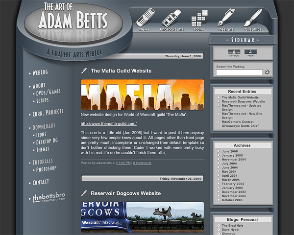
Art of Adam Betts v1 design.
Boom, no more hockey puck.
The new plan for this updated weblog is:
- One post per year (two if the weather outside is beautiful.)
- Less texts, more pixels (less bad grammars, woot!)
- Fixes for IE browser. *sigh*
![]()
Art of Adam Betts v1 design.
Boom, no more hockey puck.
The new plan for this updated weblog is:
 8 CommentsLeave a Comment


Nicely done Adam…as always, your work is incredible.
w00t! I love the new site. Much more glossy than the previous one too =D
I like your blog, it seems like organization of content was taken into account which I like. I also like that you simplified it more.
Damn, that’s it? You said the new design would make the old one look like the toilet seat iBook.
The only thing you really changed was the big circle with your name on it.
Let me introduce you to second-generation iBook
http://upload.wikimedia.org/wikipe...
The only thing they really changed was the clamshell design!
Of course I’m not serious, there’s more to see but only if you choose to see them. If you only noticed the removal of hockey puck and nothing else then I guess that’s good enough for me. Better than simple recoloring or minor changes that most people won’t notice.
Adam, Like the redesign! To be honest, I’m just now getting around to your site. I’d gotten out of the habit of checking. Noticed it’s RSS fed – very handy. Anyway, good riddance to the “hockey puck” – although the URL icon still very much reflects that old look. ;)
Keep up the great work!
Cool glad to hear :)
I think you’re still seeing old favicon, Safari won’t update favicon forever until you delete them manually. New one is flat and square with simple “A” on it.
I use Safari Icon Manager to delete one or all favicons.
http://versiontracker.com/dyn/more...
Give it a try.
You are absolutely correct. Thank you.