
![]()
Who, me? Maybe. Read below.
I’ve been asked several times if I really did design the icons for Bare Bones‘ Yojimbo, the answer is both yes and no.
Toolbar, sidebar, etc. icons: Yes.
![]()
Various 32×32 Icons.
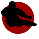
Main application icon (red moon with black silhouette): No.
I had several icon drafts on paper for main application icon but they did not want me to do any of them. Instead I was asked to gloss-ize a graphic file they sent me.
What I had in mind (and on paper):
![]()
I wasn’t pleasant with their decision because I will be associated with icon that I actually didn’t design. I do understand that they were only looking for pure branding logo and not standard icon but personally I strongly believe that this kind of app is better suited for standard design like the proposed design above.
The icon they went with is ugly as hell in my opinion. Too in-your-face bold color. One of the comments from software update website put it nicely:
“The app itself looks great, but sports one of Bare Bones’ usual crappy icons – a silhouette of a martial arts guy that my daughter thinks is a witch flying toward a harvest moon.”
But do they work well as a brand? I’m afraid so. In fact it’s very effective, I’m told.
So were the developers right with their decision or they should have went with standard icon? I’m not going to change anything, I’m just wondering about how to handle an issue like this in the future. Who should decide that icon should be pure brand or standard: Developer or Graphic Artist? Common sense, it should be developer but graphic artist do know what works and what doesn’t.


From an aesthetic viewpoint, I prefer your icon, but I believe that the developer made the right choice in this case. Why? Because there are several apps already out there that are very similar to Yojimbo: MacJournal, DevonThink, Journler, and StickyBrain. The developer needed to distinguish their app from the others and a distinctive icon grants their app instant recognition (and hopefully, a healthy chunk of marketshare).
I much prefer your icon over theirs. Much more refined and professional.
The original icon is pretty flat, but your “fixed up” version has a straight line right across the middle. Why did you put that there?
Your book icon looks like a book at 128px, but at 48px, it looks like a small piece of toast. That icon would not work in the Dock.
Take another look at flat version, you’ll see that I did not add anything, the line is there although it’s very subtle. I copied the image from earlier revisions with higher opacity. There’s no conspiracy going on here ;)
About the book icon, you’re testing a rough draft and decided that it would not work in the Dock? You do realize that if I start the work on icon, it will be created from scratch with careful attention to small sizes?
Adam,
I think everybody has different view on the artwork. Personally, I do not like the Yojimbo icon because I had no idea, but I have to agree that it does stand out.
You did a great job on “gloss-ise” the flat icon. Thanks.
Your icon designs are really nice. Great work. You should certainly be proud of those.
I have to agree, though: the application icon sucks serious ass. Your proposed design is a LOT better (although I think the kanji needs work, but after all it was just a rough draft), and if you haven’t already done so, why not release it and let people change it to the way it should have looked.
I don’t buy this “branding” argument either. There are plenty of apps that are well-branded, with recognizable icons that don’t look like crap. An appropriate example is the previous BBEdit icon, which looked just fine until Barebones decided to change the venerable letter B into a joke (presumably to give it a similar look as the TextWrangler icon, which is also a joke).
I don’t get the nonsense name (what the hell is a Yojimbo anyway?) or kung fu theme either. Is it really their entire concept to just make it so stupid that you can’t forget it? Let’s just be thankful that these guys can only butcher a handful of niche products (though BBEdit happens to be one that lives in my Dock 24/7), and aren’t naming our OS releases, or we’d probably have Mac OS X 10.5 “Fnardleborp” to look forward to instead of “Leopard” (and in place of the big glossy metal X would be a cartoon giraffe eating a giant crayon, for no apparent reason — hey, it’s starting to sound like a true Unix distro now.)
It seems likely that this blunder is the all-too-common result of design-by-committee (in this case, a committee that consists entirely of engineers who can’t tell the difference between good design and their 3-year-old’s first drawing posted on their fridge). As a fellow designer, I feel your pain.
If you look at it from another angle, though, the Yojimbo icon does fit in perfectly with all of Barebones’ other icons, in that they all look like someone was trying as hard as possible to suck on purpose.
In any case, it’s clear which elements were your own creations, and those ones are very nice indeed.
For what it’s worth, I think the icon they chose is much better. Even though it is not “standard”, it accomplishes their goal perfectly and distinguishes itself from ALL the other similar apps available. Besides, who says you can’t just have “fun” with an icon? I like their irreverence.
Good point, irreverence is a nice word for this.
I’m still wondering why they have a ninja instead of a samurai.
the barebones icon *sucks* badly. i love your icon. i ran into this page while looking for a replacement icon for yojimbo — which, like all other bb apps: great app, suck-ass icon.
Sorry, I just stumbled across this post, so I’m late to the game. The comment thread appears long since dead and I’m writing this against my better judgment. But I can’t resist. :)
I don’t get the animosity towards the Bare Bones icons. Yeah, the wacky “B” on the old BBEdit icon was a mistake, but other than that, BBEdit’s current icon suits the product well. It’s distinctive and easily recognizable at all sizes, and, the right angles suggest the tools of a draftsman (perhaps a play on the old Bare Bones draftsman mascot?). Perhaps you wouldn’t call it beautiful, but I think it’s at least handsome.
As for the Yojimbo icon, Adam’s rendition is quite nice. Judging by his other work, I’m sure it would have looked great in its final form. But in this case, I think I’d still have to vote with the current red moon version. Thanks to Adam’s polish, I think it looks quite nice: it’s simple, distinctive, easily recognizable (at least it is for me), and attractive (again, at least to me). Of course, critiquing icons is highly subjective.
With the greatest respect to Adam, I personally feel the angled book theme is tired (as is the angled stack of papers with a pen for document-based apps). Yeah, I know it has inherent meaning that tells the user what kind of app it represents. But if the app’s brand identity is strong enough, those hints aren’t necessary. Does anybody NOT know that BBEdit is a document-based app? The BBEdit brand is so strong in the Mac community that its icon has almost become synonymous with text editing.
The icons for BBEdit and Yojimbo are bold, unconventional, and, as others have already mentioned, irreverent. And I think it works for them.
Now, for Jason’s comment on the “Yojimbo” name, Wikipedia reads: “In Japanese, a yojimbo (用心棒) is a bodyguard or security person.” A yojimbo might be a rogue Samurai or they might be a trained assassin. So why not a Ninja or any other character with a mean flying kick? It all part of the app’s brand and fits with it’s motto: “Master the Onslaught”. A little bit dorky? Maybe. But it’s also cute and memorable. And like the icon, I think it works.
Saying “why not” in regards to using a ninja as opposed to a samurari (or ronin) shows a lack of understanding as to how yojimbo were actually employed and what they actually were. Ninjas were spies or assassins – in other words, secretive. Yojimbo were paid bodyguards and were therefore in the public view. So in essence, this would be akin to naming your application “Sheriff” and using a silhouette of a sniper for your icon. Just because there may have been a tiny overlap in potential duties (and I mean very tiny) doesn’t excuse poor branding.
The fact that BB refused to even employ an image which is related to their title shows that they likely gave very little informed thought to the aesthetics as well.