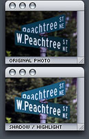
Shadow/Highlight DialogRequires Photoshop CS

So you want to brighten your photo without doing complex manipulations?

Meet Shadow/Highlight. You can call him “The Light Man”. He can create lights out of nowhere and like to eat shadows for breakfast. Got some dark photo? ‘The Light Man’ to the rescue…

Original Photo enhanced by Shadow/Highlight1. Choose Image > Adjustments > Shadow/Highlight…

2. In the Shadow/Highlight dialog box, set Shadows Amount to around 30%. Darker photo = higher Shadows Amount.

Highlights is not always necessary but it’s good for reducing the amount of whiteness in photo.

I don’t use this feature that often but it’s essential to all kinds of photographers.

During the 5 hours driving back to my home with Jetta 2000 yesterday, I hit a young deer very hard at around 75 MPH. It was raining pretty bad that day so visual distance isn’t great. Everything went slow motion after I saw that deer’s eyes..

Luckily, I turned right a bit and hit him by the corner of my car’s body frame instead of middle. If he hit my car in the middle, my car’s bumper and hood would have been crushed like a cheap soda can and windshield all cracked. I also could have been hit by a large truck following me. Adrenaline Rush saved the day.

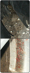
Amazingly, the damage on my car is very minimum. The only thing that is damaged is plastic in the tire area (maybe worth around $100) and some bended plastics. There’s lot of blood and fur all across the side of my car. My leg’s pretty sore after flying off the seat (even with a belt on) and hit the driver’s wheel. Very bad headache too.

I did plan to find a nearby policemen so I can ask him/her to fill out a report but changed my mind as I remember that any nature-related accidents get a 25/75 chance of being covered by insurance company. If they’ve decided not to cover it, my monthly insurance bill will be much higher. Around $100 for a plastic part isn’t a big deal though.

Truly a scary experience.

Adobe CS’s icons are currently the most hated icon set and personally I’m not sure why. I thought it was a nice changes from previous icons where they are too cluttered and cheaply done. Of course, it takes time to remember which icons belong to what applications but after that they’re fairly easy to remember. I also like the fact that they’re more consistent with each others instead of giving each of them their own colors.

If you hated it, how come? Do you replace the icons with something else?

I got accepted as a beta-tester for Blizzard‘s World of Warcraft a few days ago and I’m very, very addicted to it already. This is the kind of game where you wish you could stop doing anything just to have more time playing it. Even non-hardcore gamers will love this game.

Going back to WoW…

Mystery Photo #6
ImageLast week’s answer is Hot Dog. Their rival is Hamburger :)

Adiumy - I'm just a bird...
Adium Icon was perhaps one of the most controversial icons I’ve done. It’s one of my early works and was the key icon that got me into the whole OS X Icon Scene.

From what I’ve read on the forums, emails I’ve gotten, comments on software update sites, etc; public’s opinions on Adiumy Duck was fairly split. Some hated it with a passion and some loved it with a red cherry.

Here’s few of the amusing comments (some funny, some really stupid) regarding Adiumy Duck Icon that I’ve found:

“I hate the stupid squawking bird icon”

“What’s with all the bird icons for Adium? They all creep me out…those eyes just staring…”

“I think that bird-type-creature looks horribly ugly.”

“Once you replace the butt ugly icon with other icon it’s a great program”

“This mismatch of Aqua and chicken-scratch icons is headache-inducing.”

” WAUGH! The new dock icon sucks!”

“I won’t use Adium because I don’t want to bother editing the icon”

“I have to say I REALLLY do hate that duck, just screams ms office assistant to me. Don’t get me wrong I love little character things but when they’re not corny like that duck ugh thats why mine is hello kitty instead.”

“New dock icon please That dock icon is ugly”

“He goes against Apple’s guidelines; a photo-realistic icon that represents the function of the app and instead creates a cartoon bird that represents nothing of what the app is about.”

“I use Proteus. I would use Adium if not for that fscked up duck. *shudder*
It’s just so… duck-ish… WTF does a duck have to do with instant messaging?”

Those kinds of comments do not offend me in the slightest. I’m only laughing because it’s funny how a completely harmless and simple-minded bird could cause so much pain in some people.

It’s also funny how some people refused to use an app just because of the icon. It’s like saying “I won’t go outside because I don’t like the color of the sky.” That Hello Kitty comment is hilarious because Adiumy Duck couldn’t possibly be any cornier than Hello Kitty :)

Psiona's Costumes for Adiumy BirdWithout those haters, Adiumy Duck probably won’t be at a celebrity status like he is now. Psiona (Official Costume Designer for Adium) also contributed a lot to his popularity by designing some award-winning costumes. Give her portfolio a check and you’ll be impressed.

All in all, I’m glad that Adiumy Duck is enjoying his life even though he couldn’t comprehend most of the insults to him (a good thing if you ask me). Now only if he finds a girlfriend…

Mystery Photo #6
ImageLast week’s answer is Potato. Mr. Potato Head is the toy based on it.

Hint: it has a rival.

The reason I edited Monday’s post out was that I recently got a project inquiry from Microsoft IT Department for Icon Design and I want to avoid any potential conflict of interest. I know I should be putting my foot in mouth for contradicting myself but I love a large and challenging project and this one interest me.

The only problem is that they require an active business license and we don’t have that right now. I’ve also gotten a project inquiry from ATI a while ago but I have to turn them down for the same reason.

Right now I’m going to learn more about getting a business license. If you know a great place to get information about getting one, it would be appreciated if you could post it here. Thanks.

I’m beginning to get sick of one thing and it’s people asking me to do Windows Icons for their applications. Don’t get me wrong, this is perfectly okay with me but when I said I’m not interested, some of them tried to fool me by sending me a different email under a different name and email address and even claiming that they’re developing for Mac OS X. This has been happening more than several time and I’m pretty unhappy about it. One of them went as far as saying that if I know any better, designing icons for Windows is the right way to go. This coming from a medium-sized company.

The reasons behind this are that I prefer to follow other platform’s guidelines closely and have the right resources to do so instead of designing icons with a blindfold. I’m not familiar and have no interest into learning Windows or any other platform’s guidelines. There’s no way I will be designing OS X style (or the over-abused word ‘Aqua’) icons for Windows because that is NOT their main style.

[/end rant]

Big Bang ChessFreeVerse recently released a new freeware game called Big Bang Chess. I was never a fan of FreeVerse games (feel too ‘Carbon-ish’, some weak graphics, etc) but this new game really changed my opinion. The graphics and OpenGL effects in it are very well-done and beautiful. It’s one of the most OS X-like game I’ve seen next to Stratéges, iConquer, JewelToy, and few others.

The only thing I don’t like about it is, of course, weak App Icon :)

If you’re on Mac OS X 10.3, give it a try.