Last week’s answer is LEGO tire like many have guessed. If this photo is too easy then next one will be very hard :)
Hint: there is a toy based on it.

Last week’s answer is LEGO tire like many have guessed. If this photo is too easy then next one will be very hard :)
Hint: there is a toy based on it.


PulpFiction will be available at an introductory price when it’s out at May 15th. Better grab it while it’s fresh!
One thing I’m curious about is if there’s a high demand for Graphite Icon? I would be glad to make them if enough people prefer Graphite over Color.
Some of you have been asking when will I release next batch of Flag Screensavers, I plan on releasing them sometime next two weeks. My clients’ projects is on the highest priorities right now.
Several more flags will come after that then it’ll be the last. I have some other ideas that I would like to work on next :)
 Comments Off on Flag Screensaver
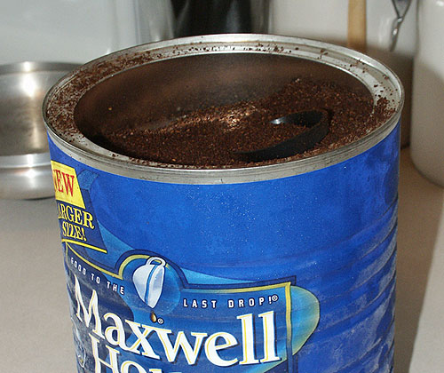 Last week’s answer is Coffee. I took a detailed photo of it so I can analyze the textures and figure out why the hell people like it. I could never get into coffee because it tasted like melted wood. I prefer to drink Mountain Dew for breakfast.


Since some fathers (Adium users) of Adiumy Duck Icon demanded to see their long lost son, I thought I should send in a pic of their sons to hold them for a while. Once the Extreme Make-Up® is done, they will be sent to home.
Graphics like this may seem like easy to make but it isn’t. You only have so few pixels to work on and adding one pixel can really affect the overall look. What’s even more challenging is deforming the beak and making facial expression to look as clear as possible so you don’t have to squint your eyes.
Any suggestion/feedback will be appreciated. I’m debating about doing smileys for 4 other colors (yellow, purple, blue and red) but I’m not sure if it will be worth my time.

 Last week’s answer is Microwave. You might have a cancer already if you stared at it a little too long.

Stattoo is pretty cool even though it’s basically feature-less at this time. I like it over Konfabulator. Here’s what I like/dislike about Stattoo:



Graphite version for Thick Strip | Blue version for Thin Strip
If you want to modify the color, etc., here’s a Photoshop file.

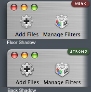 There are some people who think that Toolbar icons and Brushed Metal Window absolutely doesn’t go together, I do agree with them but after some playing with toolbar icons for my client’s upcoming application, it’s possible for them to look good together by changing the shadow setting. Instead of using standard floor shadow, I used back shadow to help create a depth between icon and Brushed Metal Window.
Another way would be insetting them like Safari’s toolbar controls but it will not works for some icons such as Manage Filters icon on Fig. 1.
Apple should address this problem in their Human Interface Guidelines if they’re going to leave Toolbar support for Brushed Metal Window.