Pixels on LCD Monitor(note: enlarged image is 1600×1500 and 1.2 MB)

It’s pretty interesting to see what LCD pixels look like when zoomed in and macro’d with digital camera.

Each pixel is consisted of three colors (RGB). I think this may be the reason why CMYK looked so crappy on LCD monitors (even with modified ColorSync setting). I usually do all of my CMYK works on secondary monitor (CRT).

I think LCD is better than CRT even though it’s not good at CMYK. It doesn’t make my eyes strain, color overall look more vibrant, save electronic, etc. The only things that annoyed me the most is ghosting problem and screen burn-in. If you leave a white window untouched for a several minutes, it will “print” on the screen and take a while for it to return to correct color. This happens even with top-of-the-line LCDs.

If you plan to buy a LCD soon, make sure it is from quality brand name such as Apple, Sony, Viewsonic, etc with long warranty. Cheap LCD usually have the worst refresh rate and high numbers of dead pixels.

For more info about LCD, go here [Howstuffworks.com]

Mystery Photo #1
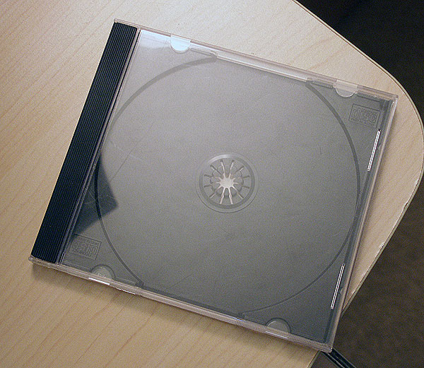
ImageLast week’s answer is CD Case. It’s the left black border that holds front plastic cover. You Music Collectors should have known better!

MacThemes.net - Updated Design
Jan and I’ve made several adjustment to the design and it should address some of the biggest complaints such as IE compatibility, navbar with current page status (note the blue pin underneath Themes), and several others.

I added a corkboard and darker blue grid to improve the contrast of the design. You can feel free to play with the pins but just be careful with them. You know, they could kill baby kittens :(

The site will hopefully be ready by tonight.

Apple Motion

“Motion is a completely new take on motion graphics for film, TV, video and DVDs. Motion brings together design, productivity and industrial-strength output in one comprehensive package.” – Apple Motion

I’m so drooling at this! This is exactly what I’ve been needing for DVD Multimedia, TV commercials, etc. I’ll buy two licenses once it’s out, one for me and one for my brother.

This ought to teach Adobe some lesson for not paying close attention to AE on Mac. It’s a Bad Carbon Port™. AE’s performance is terrible and the GUI is so 1990s.

Mystery Photo #1

Guess what it is. Answer will be posted with next Mystery Photo.

Application Icon Replacement - Flash/Fireworks MX 2004
More replacement icons.

All Applications Document Icons are also included in the package.

FontBook Icon by AppleIf I have to choose one, it’s FontBook. Easily the worst icon because it’s so stale looking and aperture width is too strong.

They need to add some colors to difference it from Utilities Apps and reduce the aperture width. The type blocks need to go because it has nothing to relate with the notebook. Some contrast would help it to stand out more in the Dock.

The only thing I like about it is gradients. It’s nicely done.

What’s your most dislike Apple-designed icon?

Application Icon Replacement - Dreamweaver MX 2004
The sound of balls of steel hitting each other is getting really annoying, not to mention that it’s ugly and bloated.

The logo they used for splash screen is pretty nice and should be used as an icon instead. Why they didn’t do this is beyond me.

Say good-bye to those balls of steel.

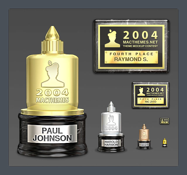
ImageI ordered several trophies and plaques yesterday and got them in today via UPS (United Pixel Shipping). The total weight of the package is around 100MB.

The models were made in Cinema 4D then brought to Photoshop for some touching up (Cinema 4D isn’t that great at rendering vibrant colors, IMO). All of the texts were done in Photoshop because I want to put some emphasis on them. They’ll look crappy if used with real shadowing.


Image

Four years ago when I was an amateur at Photoshop, I’ve wanted to make something cool for April Fool Day and came up with Shuttle launching in New York City. It’s purely experimental and have no hidden meaning.

I used Lens Flare and Burn Tool to achieve the look.