Guess what it is. Answer will be posted with next Mystery Photo.
![]()
Guess what it is. Answer will be posted with next Mystery Photo.
![]()
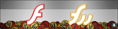
More replacement icons.
All Applications Document Icons are also included in the package.
![]()
![]() If I have to choose one, it’s FontBook. Easily the worst icon because it’s so stale looking and aperture width is too strong.
If I have to choose one, it’s FontBook. Easily the worst icon because it’s so stale looking and aperture width is too strong.
They need to add some colors to difference it from Utilities Apps and reduce the aperture width. The type blocks need to go because it has nothing to relate with the notebook. Some contrast would help it to stand out more in the Dock.
The only thing I like about it is gradients. It’s nicely done.
What’s your most dislike Apple-designed icon?
![]()
The sound of balls of steel hitting each other is getting really annoying, not to mention that it’s ugly and bloated.
The logo they used for splash screen is pretty nice and should be used as an icon instead. Why they didn’t do this is beyond me.
Say good-bye to those balls of steel.
![]()
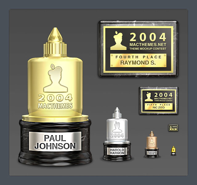 I ordered several trophies and plaques yesterday and got them in today via UPS (United Pixel Shipping). The total weight of the package is around 100MB.
The models were made in Cinema 4D then brought to Photoshop for some touching up (Cinema 4D isn’t that great at rendering vibrant colors, IMO). All of the texts were done in Photoshop because I want to put some emphasis on them. They’ll look crappy if used with real shadowing.
Â
![]()
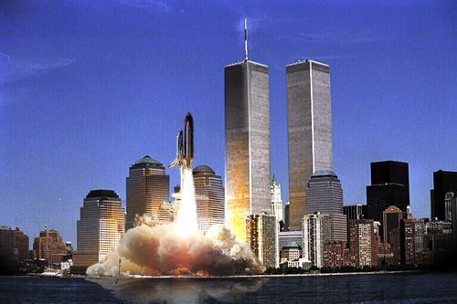
Four years ago when I was an amateur at Photoshop, I’ve wanted to make something cool for April Fool Day and came up with Shuttle launching in New York City. It’s purely experimental and have no hidden meaning.
I used Lens Flare and Burn Tool to achieve the look.
![]()
They’re finished except for the white paper on the top of wood box. I’ll think of something to put on that card soon. Maybe a vote check list with two contenders: Aqua and Luna :)
When the contest is over, the site will revert back to old design but it looks so dull comparing to the new one. I’m going to try and improve the old one by adding subtle textures, etc.
![]()

4 days and counting.
I saw most of the entries and they’re very impressive. I can’t wait to see some of them made into a theme soon.
![]()
 Only 7 days left. Stretch your photoshop muscle and build a mockup to submit! The prizes are very impressive if you ask me.
Instruction on partipicating in the contest can be found here
For those who doesn’t know, I’m a staff at MacThemes.net as a web/graphic designer
This week will be pretty busy for me since I’ll need to create trophy/award graphics, formatting the theme entries and redesign the site to feature Ballot Theme. You’ll see soon :)
![]()
 So you want to perfectly crop the document without damaging the graphics or transparency mask?
Meet Trim. She’ll be your official haircutter. She can trim away blank areas on top, bottom, left or right. The image isn’t transparency? No problem, she has experiences in trimming away plain color. Textured background, on the other hand, is out of her résumé.
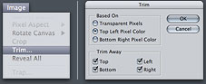 1. Choose Image > Trim
2. In the Trim dialog box, choose either:
 • Top Left / Bottom Right Pixel Color: If there is a background image in any of the colors, use this one. Top Left / Bottom Right are options to let you decide which corner to use as a start point for trimming
3. If you don’t want to trim one or more of the sides, unselect the checkboxes in Trim Away.
Your document is now perfectly cropped up. No more wasted space and file size


